Archive

Bamburgh Castle

CLIENT

Bamburgh Castle

SECTOR

Tourism

SERVICES

Branding, Website Design and Development, Design and Marketing, Campaign Development

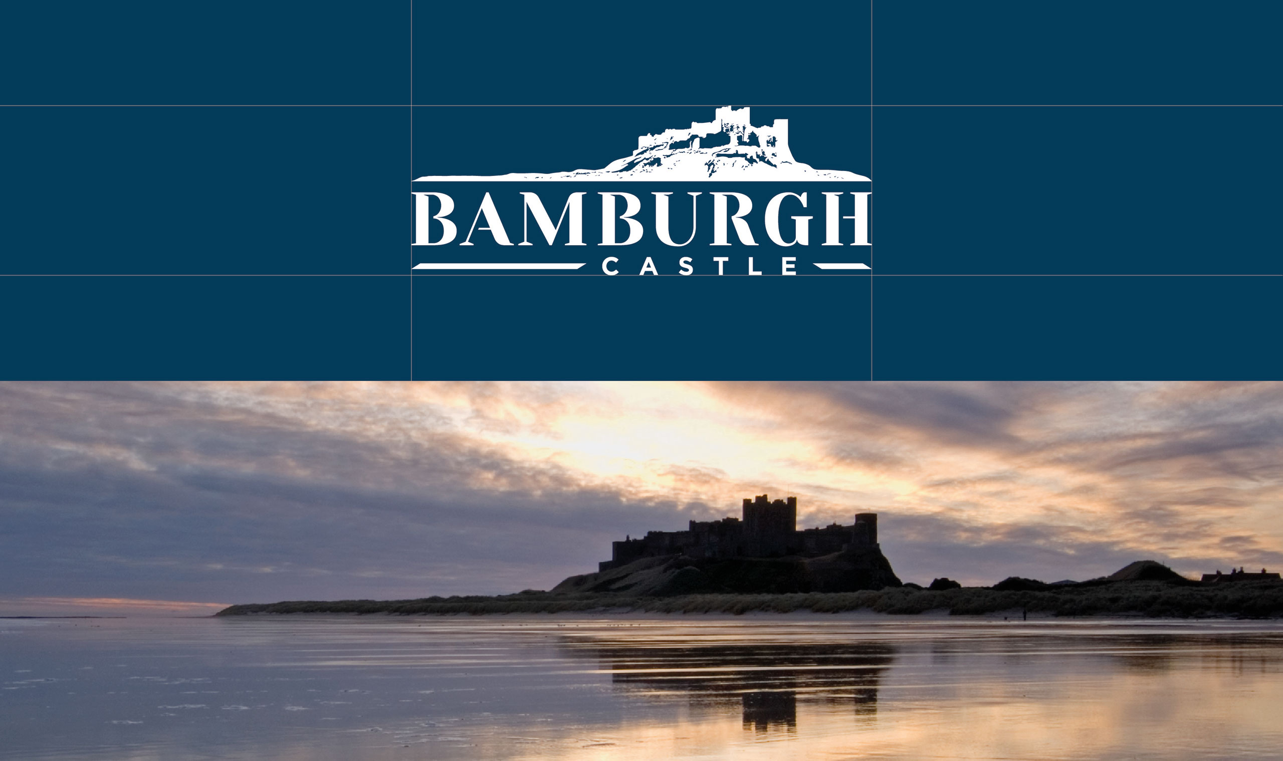
Bamburgh Castle, a historic fortress perched on the Northumberland coastline, is one of the UK’s most iconic attractions. With a deep-rooted connection to the local community, the Castle continues to evolve while preserving its heritage. In 2019, Bamburgh Castle approached Blumilk to help redefine its brand identity, enhance visitor engagement, and ensure a seamless experience across digital and physical touchpoints.
THE CHALLENGE

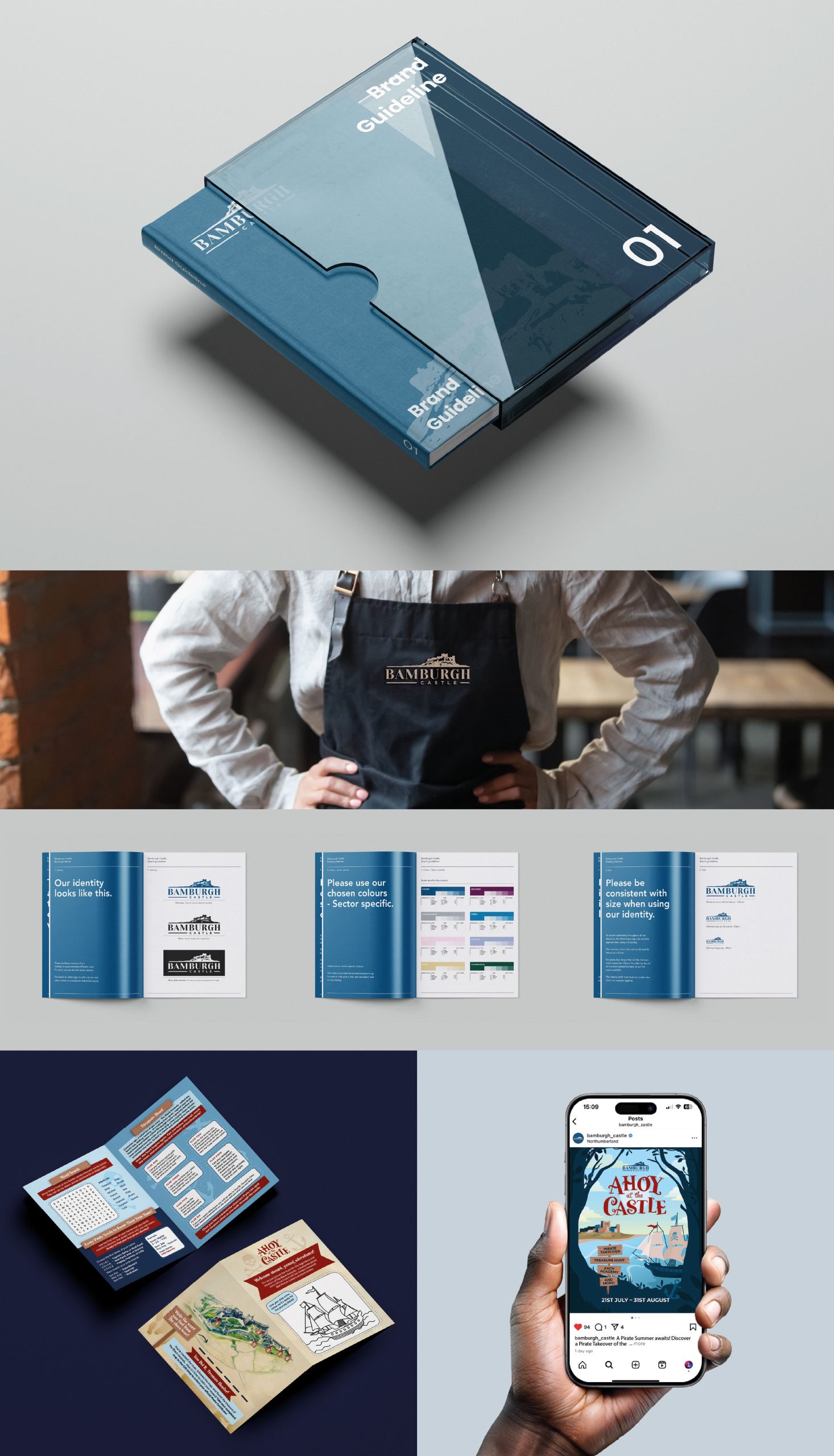
Bamburgh Castle needed a refreshed brand that would reflect both its historical significance and its modern role as a vibrant, must-visit destination. The existing branding lacked consistency across signage, marketing materials, and digital platforms. Additionally, the Castle sought to improve its visitor experience by introducing a new website with online ticket sales and developing a stronger promotional strategy for weddings and seasonal events.

OUR APPROACH
  • Brand Reinvention: We guided Bamburgh Castle through an in-depth rebranding process, crafting a striking new visual identity and comprehensive brand guidelines. These guidelines ensured consistency across all visitor touchpoints, from printed materials to digital assets.
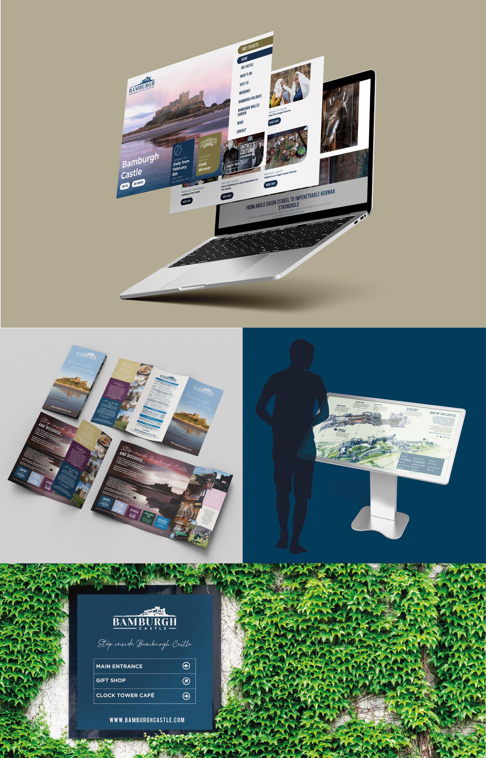
  • Enhanced On-Site Experience: We applied the new brand identity to all signage across the castle grounds, creating a more immersive and cohesive visitor experience. A new visitor leaflet and an interactive children’s activity pack were also introduced to enrich engagement for guests of all ages.
  • Digital Transformation: We designed and developed a brand-new website that not only showcased the castle’s rich history but also introduced an online ticketing system—an essential new feature to streamline visitor bookings.
  • Wedding & Events Marketing: We helped elevate Bamburgh Castle’s wedding offerings with a beautifully designed brochure, a dedicated wedding section on the website, and strategic advertising in leading wedding publications. Our creative support extended to summer event promotions, including the outdoor cinema experience, where we produced a custom movie trailer to set the scene.
  • Seasonal Campaigns: We played a key role in the Castle’s Christmas festivities, crafting dedicated campaign webpages and setting up bookable Father Christmas Grotto slots to enhance the holiday experience for families. For summer 2025, we created a campaign look and feel for Bamburgh Castle’s pirate themed summer activity – ‘Ahoy At The Castle’ which included a naming exercise, a website landing page and supporting graphics for magazines and socials.
THE IMPACT

Our work has helped Bamburgh Castle establish a cohesive, modern brand identity while maintaining its historic charm. The updated website and digital ticketing system have improved visitor accessibility, while refreshed branding and signage have enhanced the overall guest experience. Seasonal campaigns and wedding promotions have strengthened the Castle’s appeal, making it a sought-after venue for special occasions.

Beyond its role as a premier visitor attraction, Bamburgh Castle plays a vital role in the local community. The Estate actively supports local businesses, initiatives, and charities, ensuring that the Castle remains a living, breathing part of Northumberland’s cultural and social landscape. Through careful stewardship, Bamburgh continues to thrive, balancing heritage with progress for future generations to enjoy.

 

Related Work
Back to all work

The Alnwick Garden

Parkdean Resorts

Lilidorei

Atomix Educational Trust

CLIENT

Atomix Educational Trust

SECTOR

Education

SERVICES

Branding, Website Design & Development

THE CHALLENGE

Standing Out in a Crowded Educational Landscape

Tees Valley Collaborative Trust (TVCT) has always had a strong reputation for delivering education across multiple age groups, but they faced a crucial challenge: differentiation. In a highly competitive market where Multi-Academy Trusts (MATs) are rapidly expanding, TVCT needed to carve out a clear identity that reflected its strengths while positioning the trust for growth beyond the Tees Valley region.

Adding to the complexity, the trust was undergoing significant transformation, including a change in leadership with the appointment of a new CEO, Nichole Munro. With a vision of being “all teeth and elbows” and making an unmistakable impact, the trust required a brand that matched this bold ambition.

The Strategy – A Name and Identity Built for Growth

The rebrand wasn’t just about a new look; it was about redefining the trust’s purpose, positioning, and values. We needed to create a brand that:

  • Moved beyond location constraints, opening doors to national expansion.
  • Emphasised inclusivity while maintaining individuality within each school.
  • Projected strength and innovation, reflecting their expertise in transitions, problem-solving, and autonomy.
  • Positioned the trust as a leader, offering structure and support beyond what local authorities or other trusts could provide.

After extensive research and stakeholder consultations, Atomix Educational Trust was born. The name encapsulates dynamism, energy, and a future-focused mindset – perfectly aligning with the trust’s mission to lead, innovate, and embrace diversity. When describing the work they do, a member of staff described the trust as ‘elemental’ and explained that all of the schools were unique, but fused and interacted together – all moving in the same direction which inspired the name.

The Execution – Beyond Just a Name Change

The rebrand extended beyond a new name and logo. It was a strategic transformation that included:

  • A refreshed visual identity, striking a balance between authority and approachability.
  • A structured brand hierarchy, a brand that is structured for growth as the trust expands.
  • Website and collateral updates, ensuring consistency and clarity in how the trust communicates with stakeholders.

The Outcome – A Rebrand That’s Making Waves

While it’s still early days, the reception from leadership and stakeholders has been overwhelmingly positive. The trust now has a name and brand that match its ambition – a bold, forward-thinking identity that ensures they are seen and heard in an increasingly competitive landscape.
With Atomix Educational Trust, the message is clear; they’re here to lead, innovate, and shape the future of education.

Related Work
Back to all work

Scarborough College

Atomix Educational Trust

Newcastle United Foundation

ATCO

CLIENT

ATCO Gas & Pipelines Ltd

SECTOR

Utilities – Energy Infrastructure

SERVICES

Technical Report Refinement, Customer-Focused Copy, Brand-Aligned Design, Layout & Visualisation

ATCO is a major provider of integrated energy, housing, transportation, and infrastructure solutions.

They provide customers with innovative solutions in the sectors fundamental to global growth and prosperity: housing, real estate, energy, water, transportation, and agriculture. With a dedicated team of 20,000 people and a 75-year history, ATCO is a global player, working in more than 100 countries worldwide.

We recently worked with ATCO Gas and Pipelines Ltd, based in Calgary, Canada, a company dedicated to safe, reliable and environmentally responsible delivery of natural gas to customers across Alberta.

ATCO contacted us after discovering us via our website and specific expertise in making regulatory documents visually appealing, having a strong presence, while adhering to regulator’s report guidelines.

Our team embraced the time zone differences with efficient project management to ensure the project ran seamlessly and exceeded expectations.

ATCO initially contacted us to support them in creating a regulatory report that would engage with stakeholders to explain the benefits of the Yellowhead Mainline.

The Yellowhead Mainline will be a significant driver of lower-carbon economic growth in Alberta, expanding the capacity and enhancing the efficiency of Alberta’s natural gas network.

The project consists of building approximately 200 kilometres of high-pressure natural gas pipeline and related control and compression facilities that will run from Peers, Alberta, to the Fort Saskatchewan area. It was paramount that stakeholders were presented with clear information on the infrastructure.

Collaborating

Collaborating closely with ATCO’s team, we copy-edited their technical document detailing the benefits of the mainline to align the content with a customer-focused tone of voice. This process involved refining phrasing, simplifying complex sections, and restructuring the text into easily readable, accessible, and digestible segments.

With access to the full Yellowhead Mainline Report, we expanded on the Benefits document by providing additional clarity and explanation where necessary to enhance its effectiveness for customer understanding and ensuring information is adapted for the audience.

Key content, such as quotations, statistics and other project highlights were emphasised during the document’s design stage to ensure it was engaging and readers could quickly grasp the main points ‘at a glance’. While adhering to ATCO’s prescriptive brand guidelines, we introduced a fresh approach to the document’s overall design, setting it apart from their existing materials whilst keeping familiar elements. The client was delighted with the final outcome and we look forward to future opportunities to support their customer communications.

“Working with the team on the Yellowhead Mainline benefits report was a smooth and efficient process. They took a technical document and made it more approachable and visual without losing the key details, which was important for us. Throughout the project, they provided consistent communication, which made managing the different stages straightforward. Despite the time zone differences, they were flexible and accommodated our deadlines to ensure we stayed on track. Looking forward to collaborating with them again on future projects.”

Patrick Bain, Director,
Yellowhead Mainline at ATCO Gas & Pipelines

Related Work
Back to all work

CCW

Northern Powergrid

ATCO

ARC-EMS

ARC-EMS

CLIENT

Great North Air Ambulance Service (GNAAS)

SECTOR

Emergency Services / Health Tech

SERVICES

Brand Naming, Visual Identity, Go-to-Market Strategy, Website Design, Marketing Collateral

THE CHALLENGE

The Challenge – Bringing Innovation to Market in a Life-Saving Sector

ARC-EMS is not your average tech product. Developed by Great North Air Ambulance Service (GNAAS), it’s a next-generation electronic patient record (ePCR) system created by frontline clinicians to meet the complex, fast-paced demands of pre-hospital emergency care.

The software was already in development when GNAAS approached Blumilk and they knew that to launch successfully, and reach beyond their own air ambulance network, ARC-EMS needed the kind of branding, positioning, and strategic marketing expertise that would give it a true competitive edge.

We weren’t just branding a product; we were helping commercialise an innovation with the potential to transform emergency healthcare — a space where trust, clarity, and usability are paramount.

Our Strategy – Build a Brand That Commands Confidence

In the health tech sector, particularly in emergency services, marketing can’t be ‘fluffy’ – it’s about precision, trust, and value clarity. Buyers are savvy and the stakes are high. So our strategy was clear:

  • Position ARC-EMS as a clinical game-changer.
  • Communicate its frontline relevance and reliability.
  • Support a seamless transition from innovation to adoption.

We developed a bold, clinical yet modern brand identity — clean typography, intelligent use of colour, and iconography that felt right at home in both NHS and commercial settings.

The Execution – End-to-End Market Readiness

From that foundation, our role grew. Here’s what we delivered:

  • Comprehensive Brand Guidelines: Ensuring consistency and professionalism across every channel.
  • Go-to-Market Strategy: We mapped out a phased market launch, defined customer personas (from clinical leads to procurement teams), developed key sales messaging, and created a tactical marketing plan tailored for healthcare buyers.
  • Brochure Website: Clear UX and clean design helped communicate the system’s features and benefits to a wide audience, including decision-makers unfamiliar with ePCR software.

Sales & Marketing Collateral: From a high-impact product brochure to trade show stands, business cards and post-launch support, we provided a cohesive suite of assets ready for high-pressure environments like NHS tenders, tech expos, and stakeholder briefings.

The Outcome – Credibility That Opens Doors

ARC-EMS now has a professional identity that reflects the sophistication of the software and the vision of its creators. It’s already being used by other air ambulance services and is well-positioned for wider market adoption.

For us, this project wasn’t just about design –  it was about bridging the gap between frontline medical innovation and commercial viability. In a sector where credibility is everything, ARC-EMS now enters the room with the authority it deserves.

Related Work
Back to all work

ARC-EMS

Unveiled Venues

Bamburgh Castle